- Home
- works : 02 category killer
- SB design square
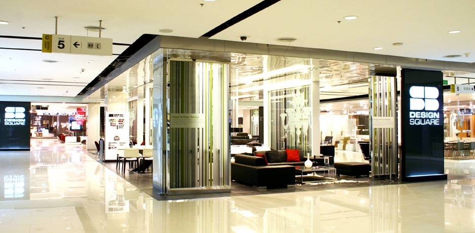
- SB design square, central world plaza, bangkok

SB design square
central world plaza, bangkok
central world plaza, bangkok
In 2004 rkd retail/iQ began working with SB to create a new to the market retail concept, SB Design Square, located primarily in suburban locations and synergizing with home centers. In 2006 the time was right to move the concept to the heart of the city.
For overall brand consistency four key components of all SB Design Squares’ acted as the foundation for this new flagship implementation.
LOCATION STRATEGY
To realize an overall brand strategy, SB Design Square at Central World Plaza was implemented to differentiate from their new suburban locations. This flagship location was identified to position the brand in the fashion forward and fast paced central retail district.
MERCHANDISE ASSORTMENT
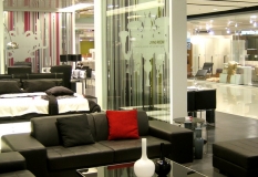
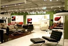
The standard core SB Design Square range was replaced with exclusively sourced merchandise from Europe and Asia with the point of view to be the contemporary living solutions provider in the market place.
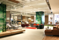
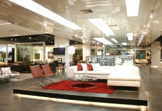
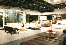
A visual merchandising philosophy based on clarity was implemented to complement the contemporary nature of the merchandise origin, to focus the customer attention on the merchandise & services on offer and create a respite from the urban chaos where the customer could relax and be inspired.
BRAND AND CUSTOMER SERVICE
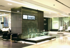
To clearly position this flagship location in the market place, new brand graphic colors, materials and details were created to differentiate SB Design Square at Central World Plaza while maintaining a relationship to the overall SB Design Square brand communications.
In home planning and design services were enhanced to match the urban customer pace and expectation. A new proprietary space planning and design program, 3D Pro Designer was developed to assist customers with visualization of their space utilization, lifestyle and budget requirements of their selections under consideration.
RETAIL PLANNING + DESIGN
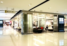
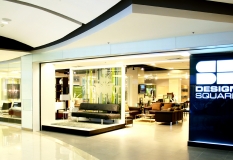
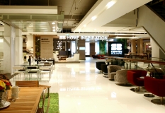
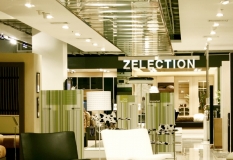
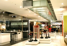
Building on clear and successful SB Design Square planning & design principles and components, the flagship location was most noticeably differentiated with the use of crisp whites and translucent panels to complement the urban mindset.
The inspirational “heart”, the “idea garden”, traditionally located in the center was turned inside out and featured as a catwalk runway leading customers from the large common area open well to the entrances of the anchor location. As the tenant space was implemented into 2 spaces , an anchor/ a satellite, one overall planning and design philosophy was essential to visually and spiritually link these adjacent but separate locations.
rkd retail/iQ was responsible for all creative expressions: brand and environmental graphic programs, retail planning + design, construction documentation and is currently rolling out the program across multiple locations.


