 Another of today’s big “come-on” word is “convenience” “Convenience” goes with “comfort” and “cost” as the three “C”s that make a shopper a customer. Not only must the price be competitive but it must go with convenience for the shopper in selecting the products in a comfortable environment. That is what “C” stores are all about: convenience. These convenience stores are usually part of a gas station or a roadside stop areas where a person in a hurry going someplace or returning from somewhere can stop in and pick up a few necessities for when they arrive at their destination or to keep them going while still the road. The C store has become much more than just an aggravated kiosk or food stand for coffee or soda and a bag of chips or pre-packaged snacks. Today they resemble miniature supermarkets or superettes where all the “necessities” and “pick-me-ups” are presented with style and flair in upscale settings. It is convenience with class! Another of today’s big “come-on” word is “convenience” “Convenience” goes with “comfort” and “cost” as the three “C”s that make a shopper a customer. Not only must the price be competitive but it must go with convenience for the shopper in selecting the products in a comfortable environment. That is what “C” stores are all about: convenience. These convenience stores are usually part of a gas station or a roadside stop areas where a person in a hurry going someplace or returning from somewhere can stop in and pick up a few necessities for when they arrive at their destination or to keep them going while still the road. The C store has become much more than just an aggravated kiosk or food stand for coffee or soda and a bag of chips or pre-packaged snacks. Today they resemble miniature supermarkets or superettes where all the “necessities” and “pick-me-ups” are presented with style and flair in upscale settings. It is convenience with class!
An excellent example of how far the C store has come is Q8/Everyday. The Q8/Everyday convenience stores are owned and operated by Kuwait Petroleum Thailand, the leading distributor of petrol in Thailand with over 130 service stations. With the rising demand for petrol and with more people moving along the highways, the company has found the convenience store growing in importance and much more profitable and predictable than the petrol. In the past, these Q8 stores averaged about 1,660 square feet but with the new concept, shown here, the space has more than doubled to 3,660 square feet.
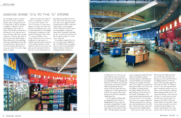
The new look for was designed by rkd retail/iQ of Bangkok and the firm, under the principle-in-charge RKurt Durrant, was responsible for “the retail planning, design and expression” for the shop. “The Q8 logotype and mark remain strong and visually fresh and rather than develop a separate Everyday identity, we developed the new brand identity for Everyday by relating to the strength of the Q8 mark.” This design was introduced in three pilot locations: one all new and two rebuilt on existing stations. According to RKurt Durrant, the shop component of the service station stands “independent of the pump island/canopy relationship and architectural style.”
The new, larger store features an entrance design that “references nautical forms to the Q8 logo.” This becomes the “main architectural character of Q8/Everyday.
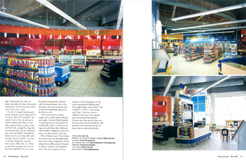
Inside the store, there is the same bold sweep of the billowing sail in the curved walls of the space, the fanning out of the suspended fluorescent lighting fixtures and the slat work in the ceiling that suggests the framework of the boat. The designers created “a clear and organized retail plan to maximize exposure and circulation” to all of the product offerings while eliminating dead corners. The strong color scheme—taken from the Q8 logo—is mainly blue and white accented with red and orange. The signage on the walls is strong and easily readable from anywhere within the store and can easily be seen from outside the shop through the tall windows that make up most of the entrance wall. In this open and daylight illuminated area, there are chairs and tables for those who prefer having their snack in the store rather than in the car or truck.
Curved, C-shaped metal panels sweep along the curved right side of the space with “serve-yourself” specialties. Each of six stations is clearly marked with what is available: popcorn/crispy snacks, pizza/pie/thai food, sausage/hot dog, dim sum/instant food, hot & cold beverages, and soft drinks. Immediately beyond on the rear blue wall under the sign “Fresh & Qool” is a series of vertical refrigerator cases for water, juice, milk, soda, etc. There are also free-standing cases out on the white-tiled floor for ice cream. Rounded end gondolas, finished with the blue laminate that is the dominant color and material used on the fixtures/fittings, appear on the floor as well.
The shortest wall is colored orange and is tiled “Qool Lifestyle” and under a frieze of lifestyle graphics showing the fun and pleasure of traveling the road, is a collection of logo accented shirts, hats, balls and other novelties. Magazines and newspapers are also located in this area,
RKurt Durrant says, “As merchandise assortments are essentially identical across major competitors, developing format differentiation focused on clarity, simplicity and organization as the core components was essential in the development of the newly repositioned Q8/Everyday.” The design brings “convenience” and “comfort” to the “C” store along with “class,” and even creates a “lifestyle” of its own. The opened stores are performing well and Durrant says that once the Iraq conflict has eased, Kuwait Petroleum will authorize the continued roll out of these stores in selected locations. |


 Another of today’s big “come-on” word is “convenience” “Convenience” goes with “comfort” and “cost” as the three “C”s that make a shopper a customer. Not only must the price be competitive but it must go with convenience for the shopper in selecting the products in a comfortable environment. That is what “C” stores are all about: convenience. These convenience stores are usually part of a gas station or a roadside stop areas where a person in a hurry going someplace or returning from somewhere can stop in and pick up a few necessities for when they arrive at their destination or to keep them going while still the road. The C store has become much more than just an aggravated kiosk or food stand for coffee or soda and a bag of chips or pre-packaged snacks. Today they resemble miniature supermarkets or superettes where all the “necessities” and “pick-me-ups” are presented with style and flair in upscale settings. It is convenience with class!