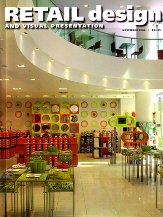
city market
retail design and visual presentation, november 2006, page 34-37
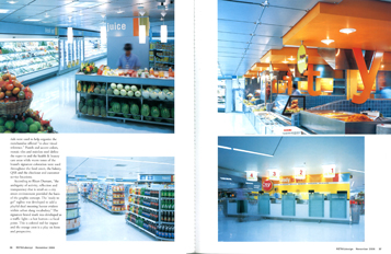
The net sales area of almost 15,000 sq.ft. of the City Market was designed by rkd retail/iQ of Bangkok to be not a “smaller supermarket—but rather an abundant convenience store.” It is located in the basement of the Sathorn City building in Bangkok and it is targeted at the young professional women workers in the building and the surrounding area. In addition to ready-to-eat and take-away meals there is a substantial offering of fresh produce, dry grocery and non-food merchandise. All this is contained in “an environment conducive to urban customers with time pressures.”
 |
 |
|
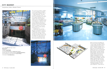 Contributing to the open floor plan and “the appropriate amount of ambiguity from super-in to super-out and convenient exposure to all merchandise and service offers: is the fact that there are multiple entrances to the City Market. The under street level space can be entered from the main street, directly from the office tower above it or from the rear parking area. The main street level entrance features a canopy of glass and stainless steel and it carriers the graphic message of City Market. “During the daylight hours the direct sun on the graphic plane casts shadows of the text in a very interesting play of positive and reserves brand and slogan messages, “ says RKurt Durrant, the lead designer and principal of rkd retail/iQ. Based on the anticipated shopper demography the store was designed with consideration to “charity of circulation and visibility,” the fixture heights, comfortable light levels and the open plan type with a centralized checkout area. All this was created and executed with a pastel color palette. The feeling throughout is “current and contemporary.” Colors and materials were used to help organize the merchandise offered “in clear visual reference.” Pastels and accent colors, mosaic tiles and stainless steel define the super-in and the health & beauty care areas while warm tones of the brand’s signature coloration were used throughout the food court, the bakery, QSR and the checkout and customer service locations. Contributing to the open floor plan and “the appropriate amount of ambiguity from super-in to super-out and convenient exposure to all merchandise and service offers: is the fact that there are multiple entrances to the City Market. The under street level space can be entered from the main street, directly from the office tower above it or from the rear parking area. The main street level entrance features a canopy of glass and stainless steel and it carriers the graphic message of City Market. “During the daylight hours the direct sun on the graphic plane casts shadows of the text in a very interesting play of positive and reserves brand and slogan messages, “ says RKurt Durrant, the lead designer and principal of rkd retail/iQ. Based on the anticipated shopper demography the store was designed with consideration to “charity of circulation and visibility,” the fixture heights, comfortable light levels and the open plan type with a centralized checkout area. All this was created and executed with a pastel color palette. The feeling throughout is “current and contemporary.” Colors and materials were used to help organize the merchandise offered “in clear visual reference.” Pastels and accent colors, mosaic tiles and stainless steel define the super-in and the health & beauty care areas while warm tones of the brand’s signature coloration were used throughout the food court, the bakery, QSR and the checkout and customer service locations.
According to RKurt Durrant, “the ambiguity of activity, reflection and transparency that is retail on a city street environment provided the basis of the graphic concept. The ‘ready to go?’ tagline was developed to add a playful dual meaning banter evident within urban slang vocabulary.” The signature brand mark was developed as a traffic light—a hot button—a focal point. This is colored red for impact and the orange crest is a play on form and perspective.
|

