- Home
- news : published works
published works
supersport MX
retail design and visual presentation,july 2004, page 20-23
|
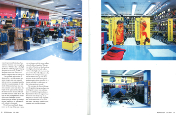
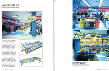
Located on the street level of the Big C Fashion Island in Bangkok is the 10,750 sq. ft. Supersports MX store: a giant supermarket for sport apparel and equipment. As designed by rkd retail/iQ of Bangkok, it is cool, open and spacious—heavy on graphics—and easy to shop. According to RKurt Durrant, the designer, “The new format provided an opportunity to reach a previously unaddressed customer demographic—middle to middle-low customers—leasing space in supermarket and hypermarkets.”
 |
 |
|
Working with that targeted market and a wide variety of products, the designers took a simple and direct approach to the design and the layout of the space. Durrant said, “The retail planning suggested a plan type is simple and straightforward with wide aisles. A proprietary fixture system was developed for its extraordinary capacity potential, flexibility of presentation functions and its simplicity and value.” Added to this is the highly effective and bold graphics/signage program that makes it possible for shoppers in the store to locate the product category they are looking for. The wall-hung merchandise is shown off in a no-fill manner: garments hung in tiers and primarily side-out with an occasional break for some face-out presentations. A wide swath of blue on the hard floor creates a dynamic center aisle down the length of the space and thus divides the store into two sections. The yellow, blue and violet colors of the MX logo are used throughout the mostly white space. Individual areas or departments are defined by overhead signage/ graphics or by walls specifically colored or decorated.
The all-important bicycle department—at the rear of the store—beckons to the shoppers with its strong yellow colored walls and graphics. The various styles of bicycles are lined up three tiers high on both the back wall as well as in the high-tech structures that jut out from that wall. Adjacent to the bicycles is the tenting/camping gear and the fashions that go with those activities. It also carriers through the predominantly yellow coloration. In a central well there is a full display of the various products in stock. |
|