- Home
- news : published works
published works
bbg hyper-mart G3
DFS wine & cigars
Ole' supermarket G4
mari
DFS vintage
DFS Galleria scottswalk
makro
holpe
blt* supermarket
suning elite
i TO i
DFS duty free abu dhabi
DFS galleria macau
Ole’ supermarket G2
SB design square phuket
greatdreams
timeout
SB design square central world plaza
B2S central world plaza
SB design square ratchadapisek
city market
Ole’ supermarket G1
data it
B2S chidlom
supersports MX
Q8 everyday
adidas
data it
retail design and visual presentation, january 2006, page 30-33
|
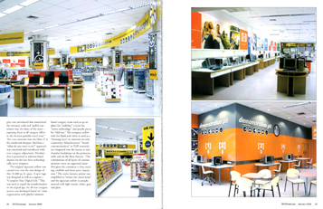
Data iT is a leading technology retailer in Thailand and through it has a prime location in the very best electronics and iT shopping center, the company seems to have lost direction and discipline during the last ten years. rkd retail/iQ was invited to “piece together the positive aspects of the operation towards building a responsible brand.”
Since product for product the merchandise assortments of the competitors are essentially similar, RKurt Durrant, of the design firm, felt that “differentiation and positioning” would be based on improved before and after sales service, a superior and informative shopping experience, and industry matching assortment and pricing.”  |

The existing layout actually deterred shoppers from entering and circulating through the store. A new plan was introduced that maximized theentrance node and “pulled customers into the heart of the store—exposing them to all category offers in the shortest possible travel time.” The core customer base for Data iT is the residential shopper, therefore a “what do you want to do?” approach was conceived and introduced with new category adjacencies. Merchandise is presented in solution-based clusters for the less than technologically savvy shoppers. The original signature yellow was carried over into the new design of this 18,400 sq. ft. space. A new logo was designed as well as tagline—“Complete Your Digital Life.” This was used to signal the |
 |
|
|
transformation to the digital age. An all new category system was developed based on “clear organization with playful solution based category icons such as an airplane for “mobility,” a heart for “home technology,” and puzzle pieces for “add-ons.” The company yellow with the black and white is used as a “focusing layer” to maintain in-store consistency. Manufacturers’ “brand communications” or POP materials are integrated into the layout as merchandise backdrops on the perimeter walls and on-the-floor fixtures. “The combination of all layers of communication create an organized chaos that gives the customers a clear, exciting, credible and lower price impression.” The entire interior palette was simplified to “reduce the visual noise” and the signature yellow is complemented with light woods, white gray and glass.
|
|

