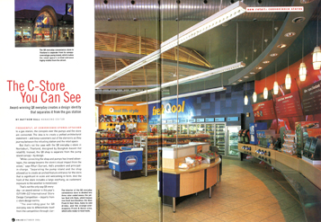
Frequently, at convenience stores attached to a gas station, the canopies over the pumps and the store are connected. The idea is to create a unified architectural statement-and keep customers out of the elements as they journey between the refueling station and the retail space.
But that’s not the case with the Q8 everyday c-store in Nontabuti, Thailand, designed by Bangkok-based rkd retail/iQ. Instead, the Q8 shop separate from the pump island canopy – by design.
 |
 |
|
“White connecting the shop and pumps has brand advantages, the canopy lessens the store’s visual impact from the street,” says RKurt Durrant, rkd’s president and principle in-charge. “Separating the pump island and the shop allowed us to create an arched feature entrance for the store that is significant in scale and welcoming in form. And the front of the store includes a large overhang, so customers’ exposure to the weather is minimized.”
That’s not the only way Q8 everyday-an award-winner in this year’s ISP/VM+SD International Store Design Competition – departs from c-store design norms.
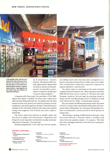
“The overriding goal for Q8 everyday was to differentiate itself from the competition through clarity of presentation,” explains Durrant. “All aspects of the concept, planning and design were focused on clearly communicating the merchandise assortment to customers by placing it in easy-to-shop categories.”
In keeping with those goals, the perimeter of the 2600 square-foot space is divided into three color-coded zones with corresponding wall lettering. The yellow Qool Life Style section houses such general non-food merchandise as hats, sunglasses, toys and magazines; the blue Fresh & Qool zone consists of the cold drinks offered in the cooler wall; and the orange-and-magenta Fresh & Quick area sells ready-to-heat foods.
The store’s layout also features an upright cooler wall that sits at an angle to the main entrance. “Angling the wall brings the most important merchandise visually and physically closer to the doors,” Durrant says.
Situated perpendicular to the wall are mid-floor gondolas holding snack items that have been arranged so customers must pass through them on their way to the cooler. That configuration maximizes customers’ exposure to impulse-buy items, notes Durrant.
The store’s name is a word play on the name of parent company Kuwait Petroleum Intl., which operates more than 5000 Q8-branded service stations in Thailand and eight European countries. Durrant says the prototype design is being used for new Q8 everyday stores in Thailand, as well as for what he terms “KDRs,” or knock-down rebuilds.
Durrant believes the Q8 everyday design would also work in the U.S. market, where the National Association of Convenience Stores (Alexandria, Va.) estimates that gasoline stations co-located with c-stores account for three-quarters of all gas sales.
“Q8 everyday’s strategy of differentiation-through-clarity has proven effective in Thailand, where it competes with many American gasoline dealers,” he explains. “We think that same strategy would work on the American companies’ home tuft.”
|

